Music and Artwork
That is a UX for me
Posted by
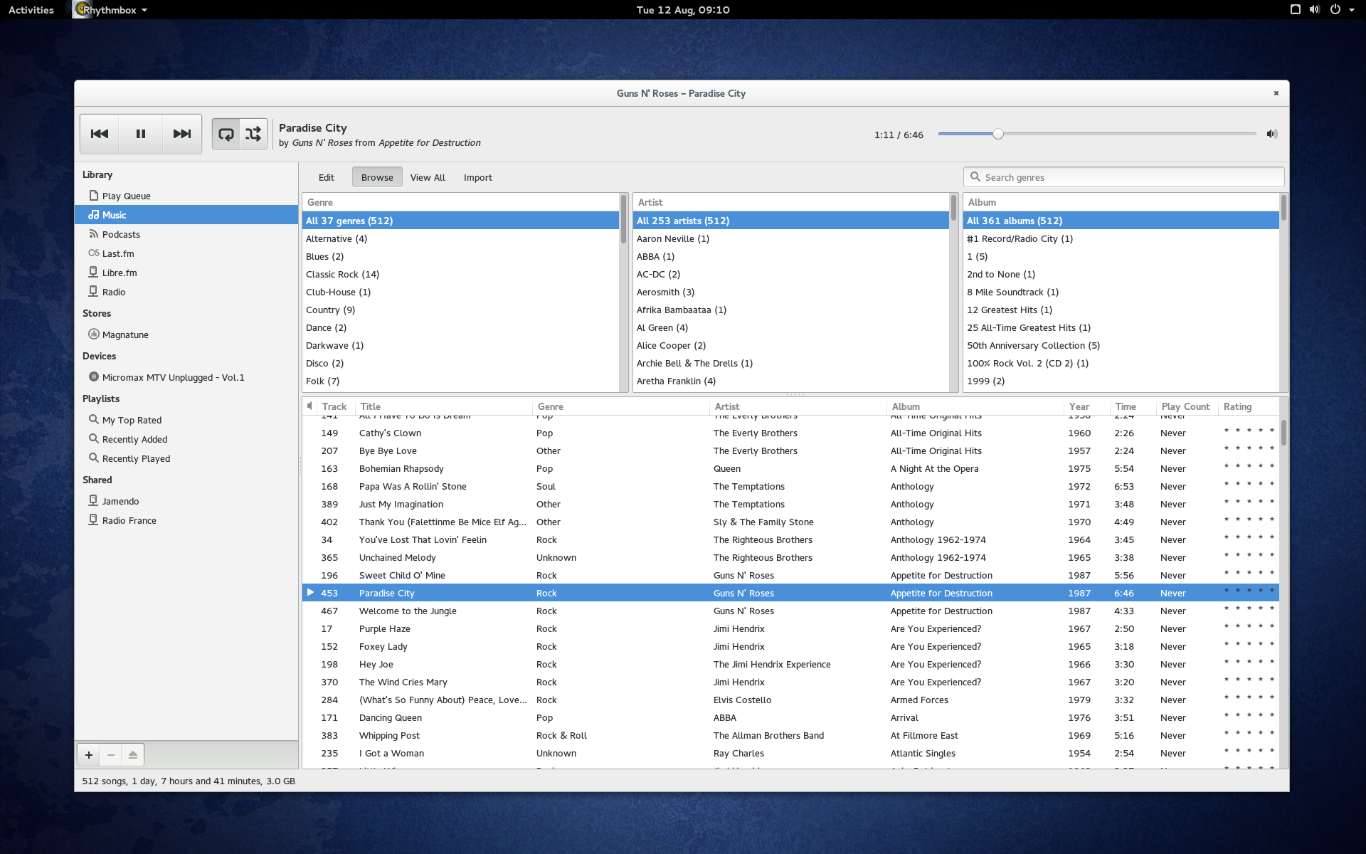
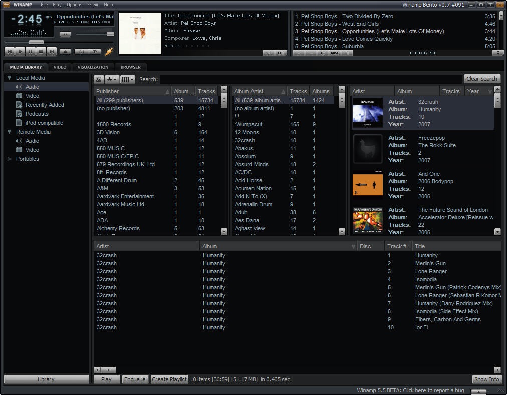
When I listen to music I almost always do it in a specific way, I listen to whole albums. Sadly most of the music players don't really offer me a good looking and easy way to consume my music like that. Most of them just offer me a lot of lists of text, like for example Rhythmbox or Winamp:
But when it comes to music I'm much more a visual person who really likes the artwork which comes with every album. That is also why I don't mind paying double the price when I buy an album, just to get the vinyl version which always has the big and beautiful artwork. Often you can even open it and it gets double the sice. This is such an awesome playground for graphics artists!
Look what for example Turbonegro did with their vinyl artwork for Ass Cobra, the Norwegian punk rock band's 1996 studio album, their third full-length:
When you open the artwork ..., or let me instead quote one reviewer:
"The photograph included in the middle of the booklet portrays singer Hank Von Helvete (Norwegian for Hell) at his chubby splendor, laying on some cheap carpet, naked and striking a pose typical of cheap European porn, only a snake is strategically placed to cover his genitals, thank god." Full review
And the photographer Morten Andersen remembers it like this:
"... so we found a dirty matress and Hank had to lay down naked like Nastasja Kinski in the famous 80's poster by Richard Avedon ... the snake wouldn't lay still so I only got to take 2 exposures before it was away. The owner said it was no danger, but when I turned around he was wet by sweat and shaking and said the snake hadn't been eating for weeks !"
You can't do anything like that with a mp3, and as gross you might find that, this is real art.
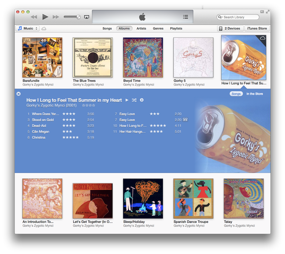
Now with this background you might understand why I really dislike the text only approach for a music collection. Which is why while everybody was hating on the iTunes rewrite a couple of years ago, I myself really enjoyed it. I was finally able to browse my collection by artwork like I have always been doing with my analog collection.
Sure it's still not as enjoyable as my vinyl artwork because it is only one picture, just the front page, no lyrics, no posters which you cang hang on your walls, sice of the pictures seldom exceeds 512x512 px, but still, it's much better than just text.
After someone stole my iMac, my last Apple device, I was struggling to find a music player which lets me browse my collection by artwork, I've been using VLC and Rhythmbox (see the first picture).
Last year I've implemented a scaled down media player at work for Neptune, which is a example QtAutomotive UI you can see it a bit in action in this video, but sadly my version didn't end up in there, because I used the wrong backend at that time. Anyway, I know how to do it, this was already my second media player, the first one was a OS X native client for SoundCloud which I called Tonality. This one never was published either because as always when you try to build something as a 3rd party on top of another companies APIs they change them in a way that your app can't use them anymore. But here is at least a screenshot:
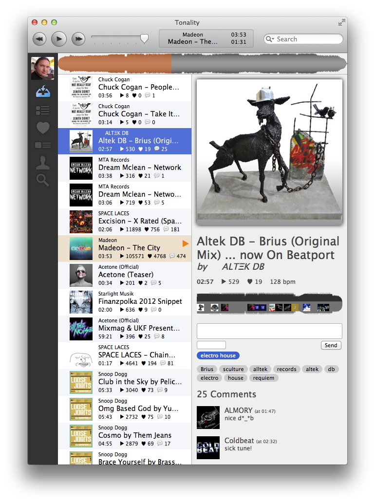
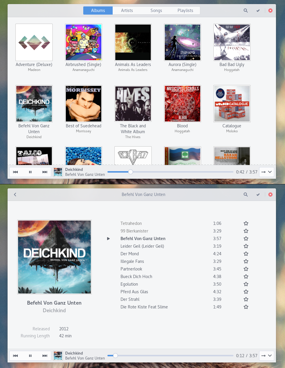
As you can see, I really like my music players to have big and beautiful artworks. One time in the future I sure will write my own music player but today I at least found a Linux app which lets me browse my collection like iTunes did, it's called Gnome Music and looks like this:

1 Reply
You are right, a lot of players take an overly technical approach. And GNOME Music has a nice UI doing it differently. But on the other hand it's missing key features like gapless playback and replay gain; heck, you can't even change the music directory, it always looks into ~/Music. And IMHO you're also missing the point about iTunes. It was not about the new music overview, this is great and I like it. It is about the missing sidebar, the mix-in between shop and your local music collection as well as Apple Music. These three problems make iTunes very hard to use, I am constantly looking for my music and am constantly confused about the navigation state.
1 Like
1 Repost