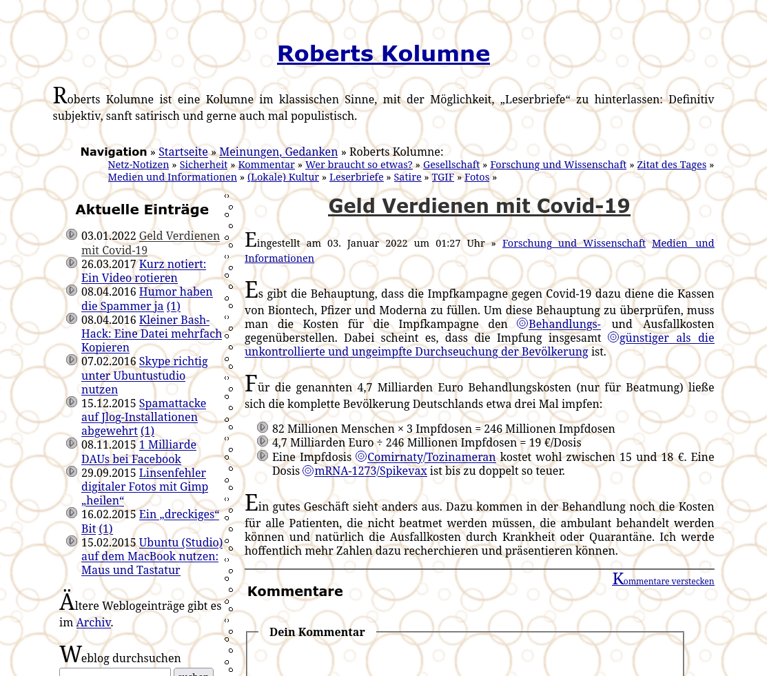
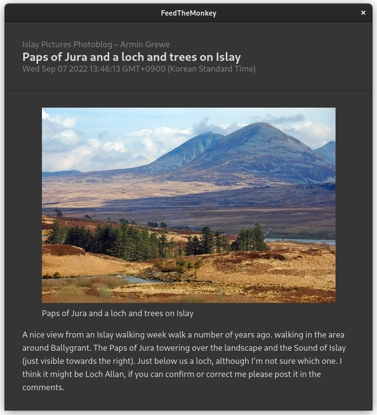
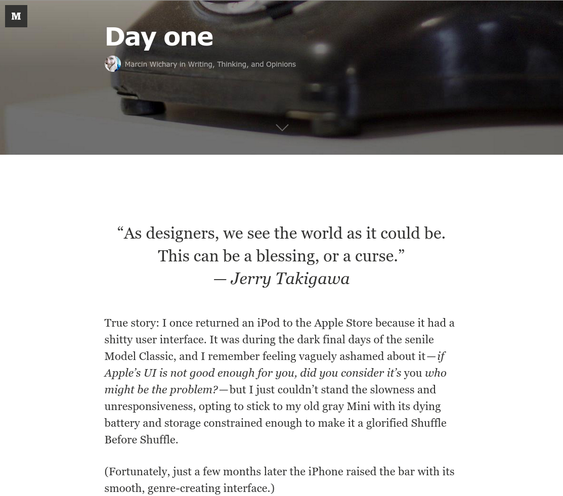
Content is King?
I was wrong about it
Posted
by
Jeena
![]()
In the early 2000:s people had websites where they posted their articles on. Those websites were very individual handcrafted, different design which would express the owners personality, etc.
![]()
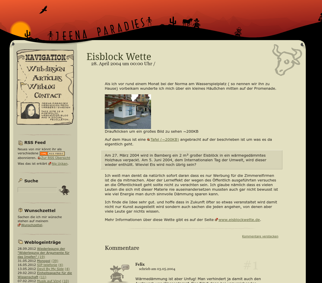
It was difficult to consume the content because the focus was more on "hey look what I did with my website" and not so much about the article. There were people who tried to adapt the design of the page to the content which was cool but a lot of work.
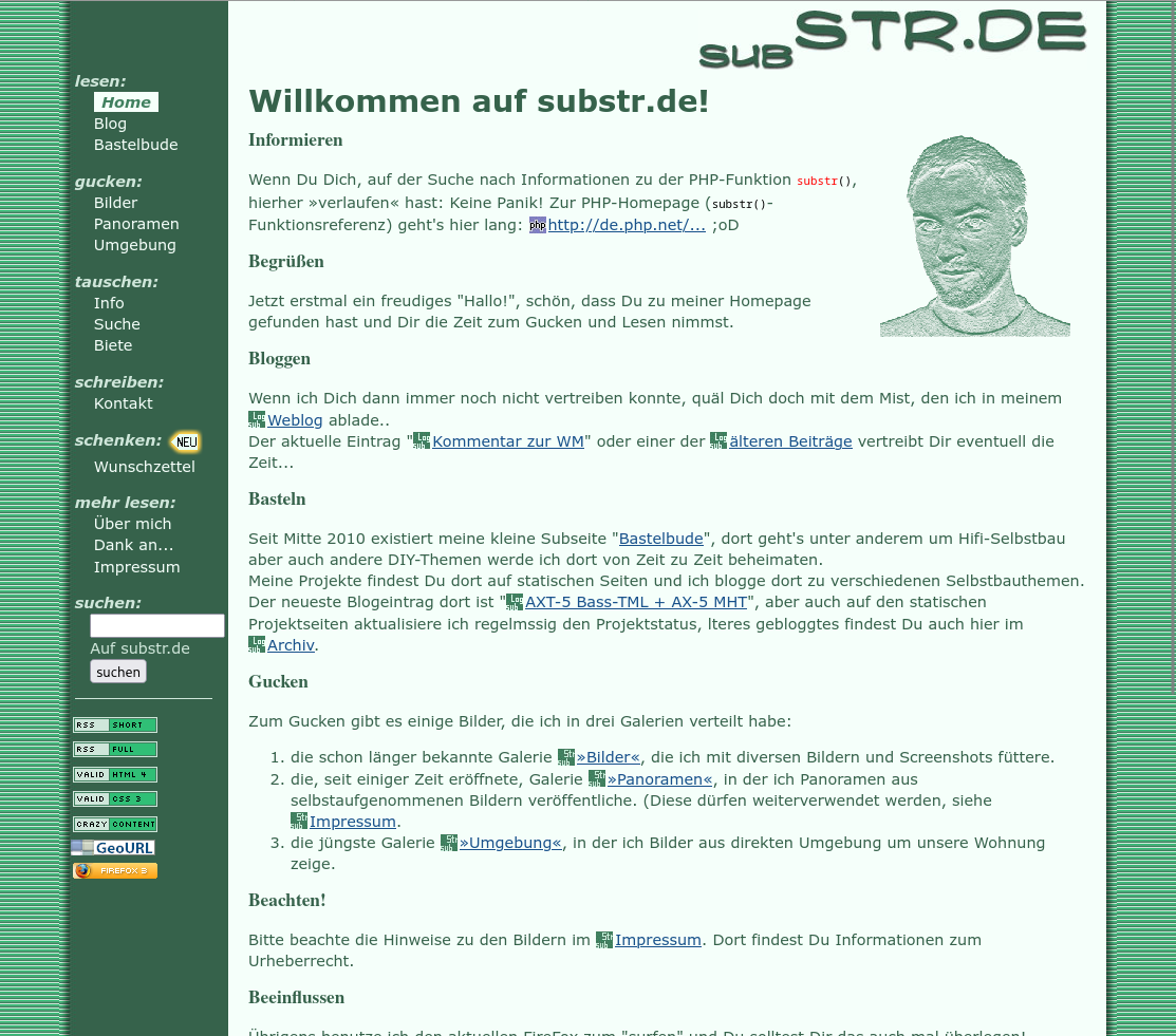
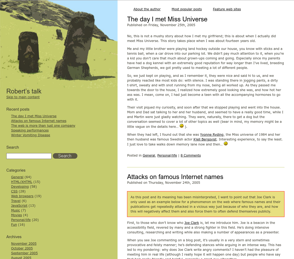
Back then I was under the impression that all that clutter - so sidebars, footers, headers, design elements, etc. - only took away from the content which I came to consume. Then slowly blogs have been introduced which with the default templates streamlined and consolidated the designs and brought more focus on the content itself. This is also the time when we started saying "Content is King" and pushed everyone to focus on the content and easy accessibility to it, instead of creatively tinker with their website as a whole and treating content just as a vessel to bring new users to the website which should be admired.
Once RSS was introduced I rejoiced and started to follow everyone who's websites I followed by opening them every day and checking for new content, by subscribing to their RSS feed. In my mind this was the perfect solution they still could have their wonky website with their unreadable design, 10px font size, dark grey and light gray text color, headers sidebars and footers full of clutter, but I would get just the essence, just the content delivered directly into my feed reader.
I even took the de-cluttering to the next level because I didn't like the available RSS readers which also had sidebars and a lot of functionality which I never used and I wrote my own RSS reader, which I'm still using. That one only shows one article at a time in what we called a "River of content". No categorization, no sidebars, no functionality other than showing one article at a time with blog title, headline, date published and the article content itself.
Over time practically everyone who had their own website offered a RSS feed because everyone was asking for it, and even though people tried to get the RSS reader users to come back to the website, because there it was they would make any money with ads (and showcase their personality with the website design). They tried to do it by only publishing the summary in the RSS feed. I hated that with a passion, and not only me, because soon the RSS readers would get functionality build in which would extract the full content from the website and present it as if it was a normal part of the RSS feed, without all the clutter and design.
Practically everyone gave up on expressing their personality in wonky design and especially once Medium.com rose with their super clean design, centered content, no sidebar, no header or footer, white background black text with a 20px font size finally everyone agreed that "Content is King" and me and all my friends copied this super clean and simple design so practically each blog and website looked the same from a distance.
But I was wrong about "Content is King"
This extreme concentration on only the content sucked out all the joy from having a website where you'd express yourself and showcase your personality. Instead to stand out you had to jump into the treadmill of faceless content creation.
Suddenly there is no community around your website anymore - although to be fair, spam comments in blogs destroyed this very early on already - but people would post links on social media to your content and discuss it there, in isolation.
And yes social media made this "Content is King" mentality obviously even more mainstream and extreme. Even if MySpace shortly allowed to express yourself by injecting CSS and JavaScript on your page, this was only very short lived and Facebook made sure that your content fits into their boxy design. You're allowed a header picture, a profile picture and that's it. No custom colors, no custom sidebars or footers, just your content in the center and Facebook's features to keep you on Facebook around it.
And it has gotten much worse since then, algorithms dictate now which content we're watching, the creator is removed from the content. Look at the design of Instagram Reels or TikTok. the content takes up 100% of the screen real estate, you have a very small circular profile picture and only space for a short username which you never can remember. Sure you theoretically can follow the content of a content creator, but this content will be burred by the algorithm.
I'm writing this article for my future self to remind me that sometimes the optimization of a craft is the reason for it's destruction because it reduces it to the most optimal version of it and kills it by making it soulless.
4 Replies
@elperronegro excellent read.
@elperronegro @Steveb https://en.m.wikipedia.org/wiki/Webring Webring - Wikipedia
@elperronegro @jeena One thing I wonder: even without the influence of tech giants, was much of this inevitable due to the limitations of mobile phone screens? In the 00s I had a personal site about my travels. I learned enough HTML and CSS to set up the navigation in a way that somehow reflected how the topic was organised in my own mind. But it only worked as long as people were reading it on a fairly large screen with lots of horizontal space. On a small vertical screen it was a disaster.
@alan @jeena similar story with my 00s website. Agree about onset of mobile phone screens, we would have had to get the content readable in any case.
13 Mentions
Content is King? - How it sucked out the joy of personal websites - Jemmy
Lemmy
El Perro Negro: "Fully agree with this interesting article by @jee…" - Mastodon
Fully agree with this interesting article by @jeena@toot.jeena.net. The fun has gone out of surfing through the internet and discovering...
20 Years of Blogging On my own website
I missed it, but last month I had my 20-year blogging anniversary. Let's recap a bit about how it started and how it went. Back in 2004,...
20 Years of Blogging On my own website
I missed it, but last month I had my 20-year blogging anniversary. Let's recap a bit about how it started and how it went. Back in 2004,...
504 Gateway Time-out
504 Gateway Time-out
504 Gateway Time-out
504 Gateway Time-out
504 Gateway Time-out
504 Gateway Time-out
504 Gateway Time-out
504 Gateway Time-out
504 Gateway Time-out