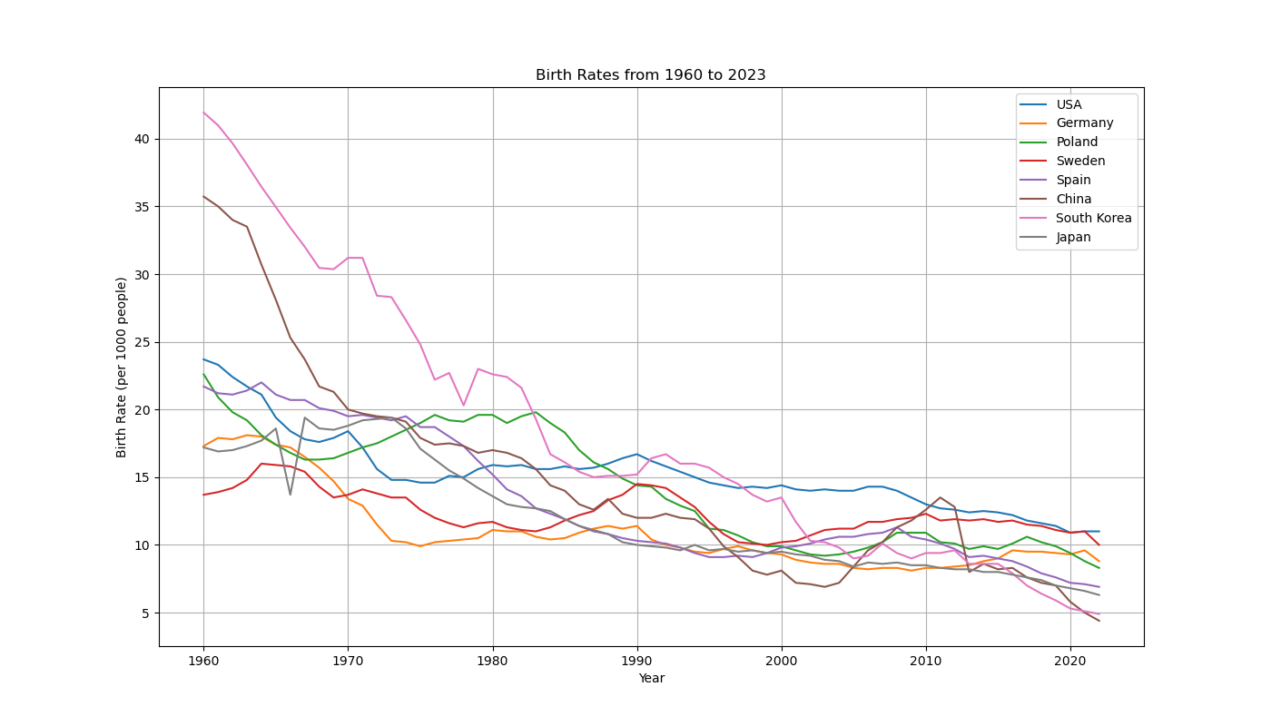
Today I was wondering how different countries birth rates compare to each other so I asked ChatGTP to make me a graph. But it was not able to, it said the code is too long or something. But it did something even better. It guided me to get the raw data myself from the Worldbank website and gave me a python script which I could use to plot the data myself. And it worked surprisingly well, this is the result.